Four Microsoft Access-era tools controlled every change to Universal Creative's Project Portfolio Management (PPM) data: security permissions, budget transfers, commitment tracking, and contract transfers. Each had grown on its own, with its own screens and quirks, despite all four writing back to the same underlying project. I mapped how their data actually depended on each other, audited each tool against the same usability heuristics, and used both to design one consistent PPM workspace.
Universal Creative's Project Portfolio Management (PPM) system was the system of record for every project: its security, its budget, its contracts, and its work requisitions. Sitting on top of it were four separate controlled-maintenance tools, each built during a different phase of PPM's life, on legacy web screens layered over Microsoft Access-era logic: Altering Security Permissions, Change in Commitment, Budget Transfer, and Contract/Work Requisition Transfer.
Nobody had ever mapped how these four tools actually depended on the same underlying data, and nobody had evaluated whether their interfaces held up against basic usability standards. I did both. I built a data-dependency model tracing every entity and relationship each tool touched back to PPM's shared Project record, and I ran a full heuristic evaluation of all four tools against the same 10 usability heuristics.
The two together told a consistent story: because these tools all wrote back to the same project data with almost no visible validation, before/after comparison, or error recovery, a person using any one of them had no reliable way to know whether their change had actually landed correctly. Left unchecked, that gap produced orphan records and data mismatches, database errors that Finance and administrators couldn't fix themselves; IT had to intervene directly in the data. I used the two research artifacts to design a single, consistent Ancillary Applications workspace for all four modules, which replaced the legacy suite with no training or reference material required.
This project combined systems analysis with usability research. Before touching any screen, I needed to understand what these four tools actually shared underneath their different interfaces.
I built a data-dependency model to trace exactly how each tool's records connected back to PPM, then ran a criterion-level heuristic evaluation of all four tools' actual interfaces.
Read together, the two research artifacts pointed at the same underlying gap, which became the basis for a single redesign rather than four separate patches.
PPM held every project's security roles, budget, contracts, and work requisitions. Four controlled-maintenance applications existed to let Finance and project administrators make changes to that data outside of PPM's own interface:
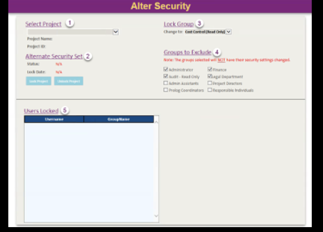
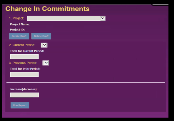
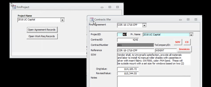
Each tool had been built independently, at a different point in PPM's history. Two, Altering Security Permissions and Change in Commitment, had at least been given a custom interface at some point. The other two, Budget Transfer and Contract/Work Requisition Transfer, had never been touched: they were still raw, unstyled Microsoft Access forms, database field names and all, opened directly by Finance and project administrators.


The two tools that had at least been given a custom interface. Numbered steps stood in for guidance; nothing here shows what a change actually did before it was made.


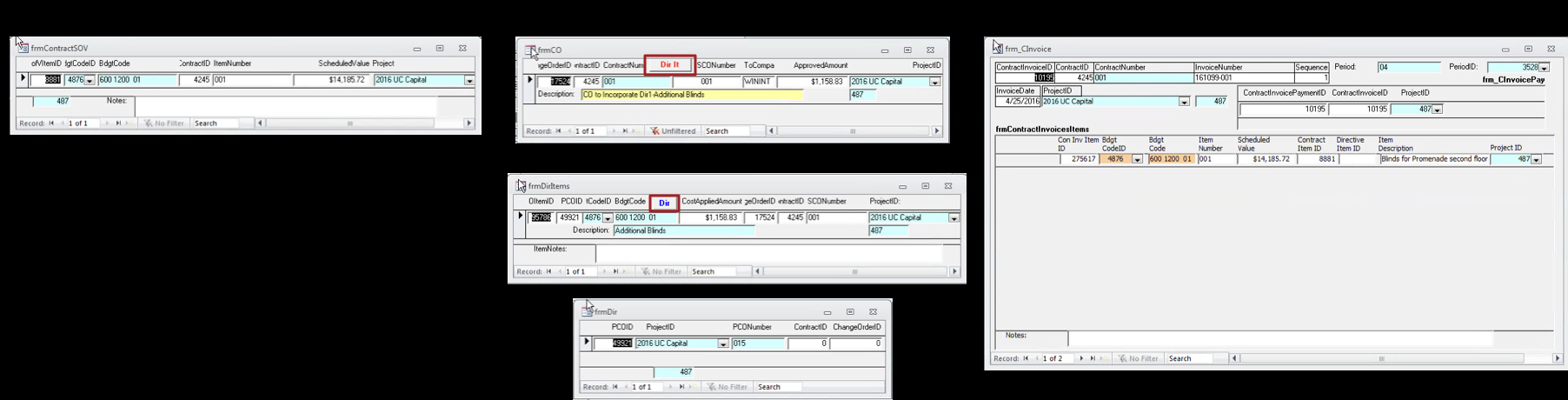
Budget Transfer and Contract/Work Requisition Transfer had no interface at all, just native Access windows. Applying a single change order meant opening and reconciling five of them at once, each exposing raw field names like BdgtCodeID and PCOID with no visual connection to the others.
None of this was hidden. The legacy suite generated 2 to 4 support tickets a month, a volume that sounds manageable until you look at what those tickets actually were: orphan records and data mismatches serious enough that IT had to fix the underlying data directly, not something Finance or a project administrator could resolve on their own.
One record had gone wrong in a way nobody could explain. It took three people three days to resolve, and the fix was restoring the record from backup. Only after the restore did anyone realize the record had been corrupted by an incorrect update made through Access in the first place.
Early on, the read on the broader pattern had been that it was a training gap, that people just needed to get more familiar with the tools. That incident, and others like it, made the case that the interface itself, not the people using it, was the real problem.
Before redesigning anything, I needed to understand what these four tools actually shared underneath their different screens. I mapped PPM's data-dependency model: every entity, key field, and relationship touched by Altering Security Permissions, Change in Commitment, Budget Transfer, and Contract/Work Requisition Transfer, all rooted in the same Project record as parent context, down through each workflow's configuration, entities, and derived records, to where every path converges on the same two final steps: validate related data, then commit the change to PPM.
Project Security Configuration → Lock Group → Groups to Exclude → Users Locked → Project Access Outcome.
Project + Draft → Period Snapshots → Commitment Adjustment → Summary Report → Financial Reporting Outcome.
Selected Project → Agreement / Work Request → SOV / Work-Request Items → Budget-Code Mapping → Budget + Reporting Outcome.
Source Project + Parent Record → Contract / Work Requisition → Direct Child Records → Downstream Financial Records → Destination Project.
All four tools ultimately write back to the same PPM project record. A validation gap in any one workflow wasn't just that screen's usability problem, it was a gap in PPM's data integrity.
The data-dependency model showed how the tools were connected underneath. It couldn't show what it actually felt like to use them. So I ran a criterion-level heuristic evaluation of all four tools' legacy web interfaces against Nielsen's 10 usability heuristics, scoring every criterion Met, Violated, or N/A per tool, with a severity rating and supporting comment.
The results were consistent almost to a fault: the same handful of gaps repeated across nearly every heuristic and every tool.
Security changes, budget transfers, and commitment adjustments all lacked a visible before/after comparison. Altering Security Permissions showed no comparison of affected groups or users; Budget Transfer had no clear source, destination, or amount-moved model.
Nothing confirmed that a transfer would leave balances intact, or that a commitment change used a valid currency, range, or period combination, before it was allowed to save.
None of the four tools offered a visible way to cancel, undo, or roll back a change once made, or a way to identify and repair a partial or failed transfer after the fact.
Contract/Work Requisition Transfer split contracts, schedule-of-value items, change orders, and invoices across independent windows with no unified navigation, forcing users to remember how each record related to the others.
Labels, sequencing, and interaction patterns varied between tools that shared the same underlying data, database-level terminology stood in for language a Finance or project administrator would actually recognize.
No tool explained which related records, contracts, SOV items, change orders, directives, invoices, had to move together, or how a recalculation was actually derived.
Taken together, the pattern was clear: these weren't four unrelated sets of usability issues. They were the same missing layer, feedback, validation, and recovery, repeated four times because the tools had never been designed to a shared standard.
The data-dependency model explained why the stakes were high: every tool's changes reconciled back to the same PPM project. The heuristic evaluation explained why that was risky in practice: none of the four tools gave people confidence that a change had landed the way they expected.
I used that shared root cause to argue for one redesign rather than four independent fixes, and translated the most severe, highest-frequency findings directly into what each module needed to show:
| Legacy Behavior | Redesigned Behavior |
|---|---|
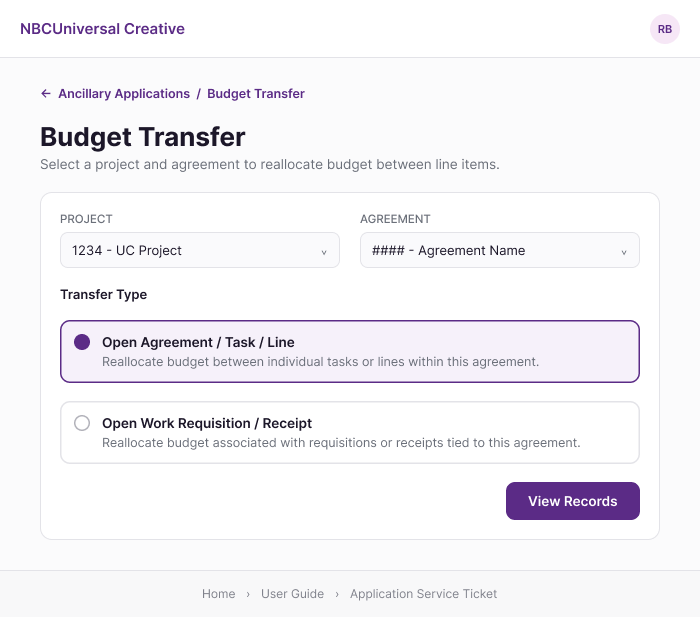
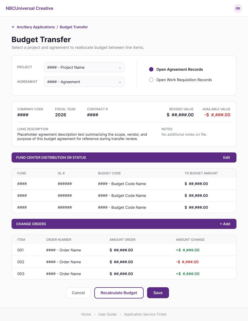
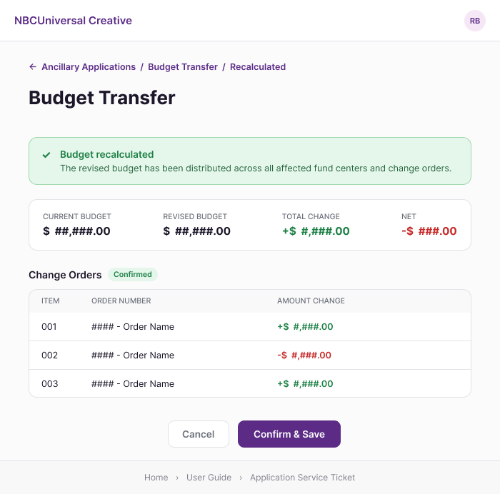
| Budget Transfer showed no clear source, destination, or before/after amount | Current, revised, and net-change totals shown before and after Recalculate Budget |
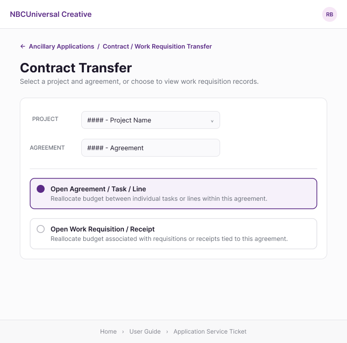
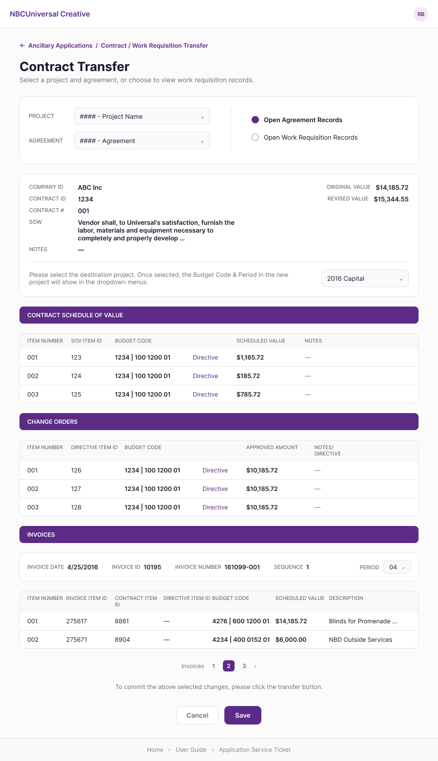
| Contract/WR line items split across separate, uncoordinated windows | Agreement, Schedule of Value, Change Orders, and Invoices shown together on one page |
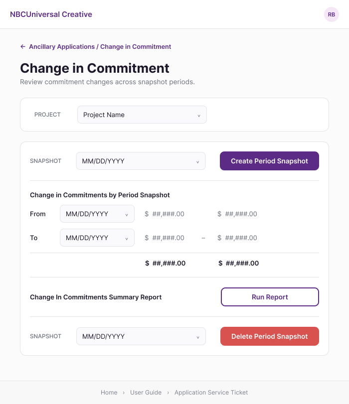
| Commitment change shown as an unlabeled value with no sign convention | From/To period snapshots shown side-by-side with explicit dollar totals |
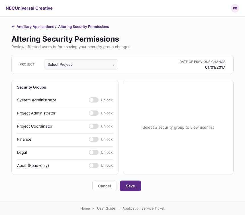
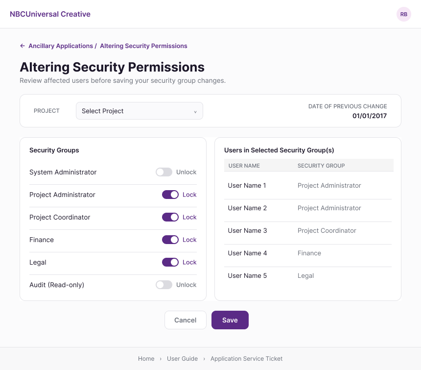
| No comparison of who gains or loses access from a security change | Selecting a group immediately lists exactly who's in it, before locking or unlocking |
Every change, security, budget, commitment, or transfer, needs a visible before/after state, not just a save button.
A contract, its schedule of value, its change orders, and its invoices describe one transaction. They shouldn't live in separate windows.
Balances, currencies, and periods need to be checked, and confirmed, before anything writes back to PPM.
Security, commitments, budget, and contracts all change the same underlying project. They should share one entry point and one visual language.
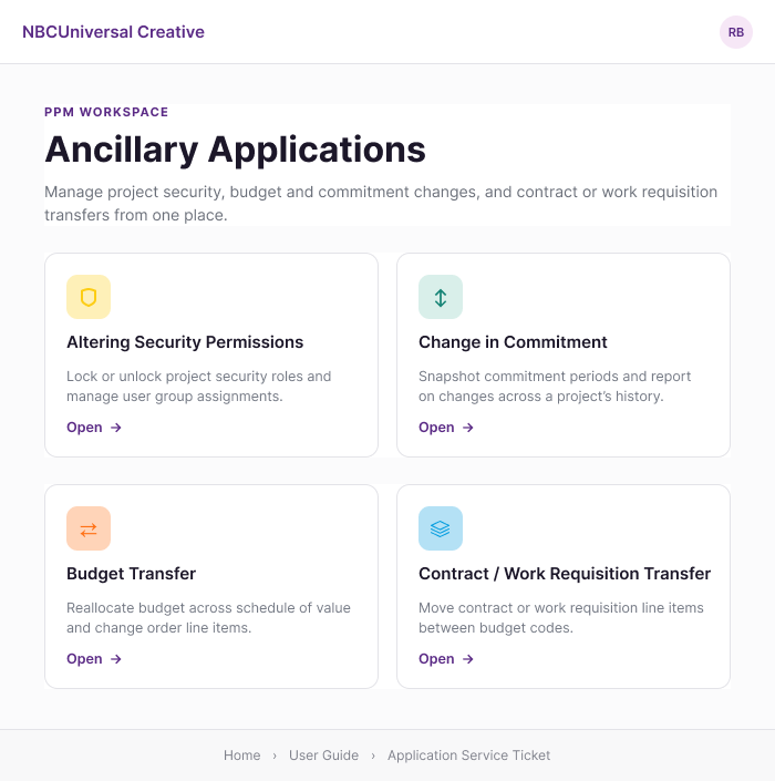
Instead of four separately-branded legacy tools, I designed a single Ancillary Applications workspace: one landing page, one visual language, and four clearly-labeled modules that each still map directly back to the tool it replaces.
One home screen replaces four disconnected entry points, with a consistent card pattern, icon, and one-line description for each module.


The legacy tool gave no clear model of source, destination, or amount moved, one of the most severe findings from the audit. The redesign surfaces current, revised, total-change, and net totals before Recalculate Budget runs, and again on a dedicated confirmation screen once the transfer is saved, so a before/after comparison is visible at every step, not just implied.


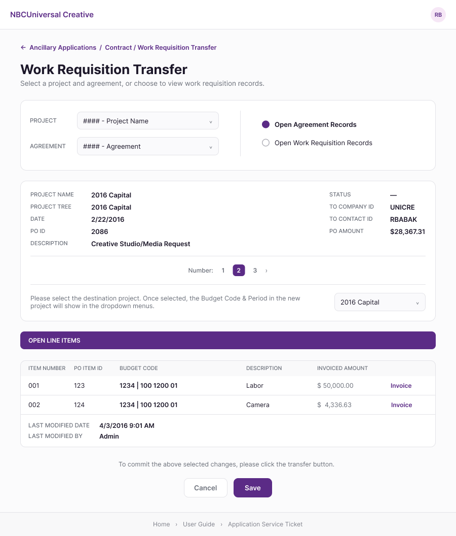
This tool had the highest concentration of severe findings: contracts, schedule-of-value items, change orders, and invoices split across independent windows with no unified navigation between them. The redesign brings all of it onto a single scrollable page under one project and agreement context, with the destination project always visible, so the records that move together are shown together.


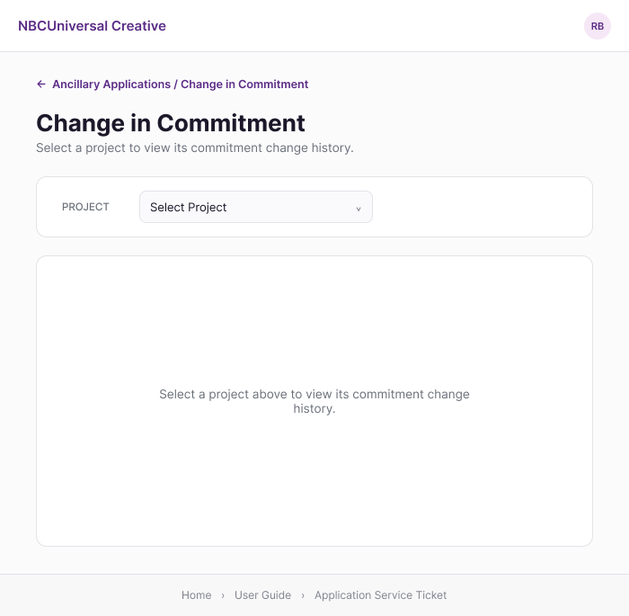
The audit flagged that the legacy tool's increase/decrease value didn't reflect a real amount, with no clear sign convention. The redesign replaces it with explicit From and To period snapshots shown side-by-side, so a commitment change is a comparison a person can actually verify, not a single ambiguous number.


The legacy tool offered no way to see which users would gain or lose access before a lock or unlock was saved, the single highest-severity finding across the whole audit. The redesign lists exactly who's in a selected group the moment it's selected, turning an invisible, high-risk change into one a project administrator can actually review first.
The Ancillary Applications workspace replaced all four legacy tools. Adoption was immediate. The legacy suite had generated 2 to 4 support tickets a month, orphan records, data mismatches, and database errors that required IT intervention. Since launch, there hasn't been a single one. The redesigned workspace eliminated those issues while requiring no training sessions, user guide, or reference materials for users to get started.
The biggest functional shift was consolidation, not simply a visual redesign. Applying a single change order in the legacy Contract/Work Requisition Transfer tool required users to work across five separate Microsoft Access windows, with no visible indication of how the records related to one another. In the redesign, the same operation became a single, grouped action on a single page, keeping related data and the change in a single context.
The redesign also introduced capabilities that had not previously existed as user-facing controls. Changes that once required someone with direct access to the Access database to make on a user's behalf were rebuilt as controlled, self-service actions within the workspace.
This project was less about redesigning any single screen and more about recognizing that four separately built tools shared the same underlying problem. Mapping the data-dependency model first meant I wasn't simply fixing what looked confusing. I could show why it mattered: every tool ultimately wrote back to the same project record, so a validation gap in any one of them posed a risk to PPM data, not just to the usability of an individual screen.
The heuristic evaluation provided evidence for that argument rather than opinion. Together, the data model and evaluation made the case for a unified redesign in a way that four independent interface fixes never could.
It also answered the question that started the project. The assumption was that users needed to get better at using the tools. The research showed the opposite, and the immediate, training-free adoption of the redesign reinforced it: the tools needed to better support the people using them.
To comply with a non-disclosure agreement, some confidential details have been omitted or generalized in this case study. All analysis and opinions are my own and don't necessarily reflect the views of Universal Creative or NBCUniversal.