Clinisys needed a data visualization tool that worked across its full product portfolio, but the requests reaching me described reports, not visualizations. “We need turnaround reports” was a real request, with no definition of what to measure or how. I built the research, the process, and the design system that turned those requests into requirements a visualization could actually be designed from, and held the line on my own role when I was asked to build the visualizations in Power BI, not just design them.
The team included a Data Scientist, a Database Administrator, a Product Owner, and a Business Analyst, but no shared process existed for bringing their respective knowledge together into a complete visualization requirement. There was no shared definition of what needed to be known before visualization design could begin, who was responsible for defining it, or when a request was ready for Design. I researched data visualization as a discipline, then built a Data Visualization Requirements process that forced the team to define the user, the data, and the relationship being communicated before any chart was chosen.
That process became the foundation for a chart selection framework and an extension of the existing design system, covering chart anatomy, axes and scales, color, and interaction. Because the visualizations were ultimately implemented in Power BI by a team without advanced platform proficiency, I also built a five-gate framework for evaluating when an implementation could be simplified without changing what the data communicated.
Reviewing Power BI implementations against that standard surfaced recurring problems the requirements and design specifications alone hadn't prevented, which I translated into a set of five Data Visualization Principles the team could use to evaluate any visualization independent of a specific design.
This began as self-directed study, working through established data visualization research and practice, then teaching those principles to a cross-functional team of a Data Scientist, Database Administrator, Product Owner, and Business Analyst who had no shared methodology for translating a request into a visualization. The requirements process and design system were built iteratively from that collaboration, then tested against real implementations through an ongoing review cycle.
Clinisys was developing an application-agnostic data visualization tool intended to support its full product portfolio rather than a single product or laboratory discipline. I was asked to design the interface using the existing design system and then extend it to support data visualization.
The challenge started with the requirements. “We need turnaround reports” was an actual request. It identified a legitimate business need, but it was not enough to design a visualization. Turnaround time still needed to be defined: what event started the measurement, what event ended it, how it should be calculated, which data should be included, how it should be segmented, and what users needed to understand from it.
The team included a Data Scientist, a Database Administrator, a Product Owner, and a Business Analyst, but there was no shared process for bringing their respective knowledge together to define a complete visualization requirement. As a result, questions about the business need, data, calculations, and context repeatedly landed with me before I could begin designing.
There was also ambiguity around the scope of Design. I was asked to develop the visualizations directly in Power BI in addition to designing them. I declined the development work and maintained that boundary throughout the project. My responsibility was to design the interface and visual representation of the data, not to implement the visualizations in Power BI.
Both issues pointed to the same problem: there was no shared definition of what needed to be known before visualization design could begin, who was responsible for defining it, or when a request was ready for Design.
My first role in IT was in report writing, so I came into the project with a foundation in structured data, queries, calculations, and reporting logic. But that experience was very different from designing data visualizations.
In application design, I was accustomed to starting with the user and their work: what they needed to accomplish, how they performed a task, what information they needed, and how the system should respond.
Data visualization required a different way of thinking. The representation itself carries meaning. Before deciding how information should be displayed, I needed to understand the data, the relationships within it, and how visual decisions could influence its interpretation.
I had a foundation in data, but I had a lot to learn about data visualization as a discipline.
I studied established research and practices through Good Charts, Storytelling with Data, Better Data Visualizations, Fundamentals of Data Visualization, Data Visualization: A Practical Introduction, and other resources.
The research changed the order in which I approached the work.
A chart could not be the starting point. Before choosing a visual representation, we needed to know what was being measured, how it was calculated, which dimensions were available, the level of granularity, what relationships existed within the data, what comparisons were valid, and what context was necessary to interpret the result.
I also became much more conscious of how easily visual choices can alter perception. Aggregation, scales, baselines, axes, visual encoding, and omitted context can all influence what someone believes they are seeing. A visualization can contain accurate values and still create a misleading impression.
The visualization therefore had to be downstream of the data.
As I began applying what I was learning, I realized this was not only a Design knowledge gap.
The cross-functional team included a Data Scientist, Database Administrator, Product Owner, and Business Analyst. Each brought expertise to the project, but we did not have a shared methodology or vocabulary for translating a request into a visualization.
That became particularly important when defining requirements.
A request such as “show turnaround time” did not provide enough information to begin designing. How was turnaround time defined? When did the clock start and stop? What unit was being measured? Was the visualization showing an average, median, range, or distribution? Over what period? At what level of aggregation? Which dimensions could it be compared across? What context would someone need to determine whether the turnaround time was good, poor, or unusual?
I needed the team to understand why those questions had to be answered before we discussed charts.
As I developed my own understanding of data visualization, I began bringing those principles into our working sessions and teaching the team how they applied to the decisions we were making.
I then translated the research into a Data Visualization Requirements process.
View the Data Visualization Requirements form ↗
Instead of asking the requesting team to specify a chart, the requirements forced us to define the user and purpose first, followed by the underlying data and the relationship that needed to be communicated.
Ownership was also deliberate. The Product Owner and Business Analyst were responsible for defining the user and goals, while the Data Scientist and Database Administrator were responsible for defining the data. Interaction requirements were defined separately, including filtering, highlighting, drill-down, drill-through, and contextual information.
This changed the conversation from:
“What chart should we use?”
to
“What question are we asking, what does the data actually support, and how should that relationship be represented?”
The requirements process became both a design tool and a means of building a shared data-visualization practice across the team. It established what needed to be understood, who was responsible for defining it, and when there was enough information to begin visualization design.
The application interface was the straightforward part of the project. Clinisys already had an established design system, so navigation, menus, buttons, dropdowns, form controls, typography, spacing, and other interface components were largely defined.
I used those existing components to design the administration experience. The work that required a new design approach was the data visualization itself. The existing system defined how the application should look and behave, but not how its data should be represented.
The Data Visualization Requirements process became the starting point for visualization design. Before selecting a chart or graph, the requirement needed to establish the purpose and scope, measures and dimensions, the relationship within the data, and the context necessary to interpret it.
This created a consistent path from requirement to representation:
Established who the visualization was for, the question it needed to answer, the decision it supported, and the boundaries of the analysis.
Established what was being measured, how it was calculated, and the categories, time periods, hierarchies, or other dimensions through which the data could be examined.
Defined what the user needed to understand from those measures and dimensions, such as comparison, change over time, distribution, composition, ranking, or deviation.
Established the reference points needed to interpret the result, including targets, thresholds, benchmarks, comparison periods, and known limitations.
Chart type, encoding, scale, labels, color, and interaction were determined from the defined requirements.
Only after those elements were defined did I determine the Visual Representation, including the chart type, visual encoding, scale, labels, color, and supporting interaction.
The framework moved chart selection to the end of the process, where it became the result of the requirement rather than the starting point.
The data relationship narrowed the range of appropriate visualizations, but it did not determine the chart on its own.
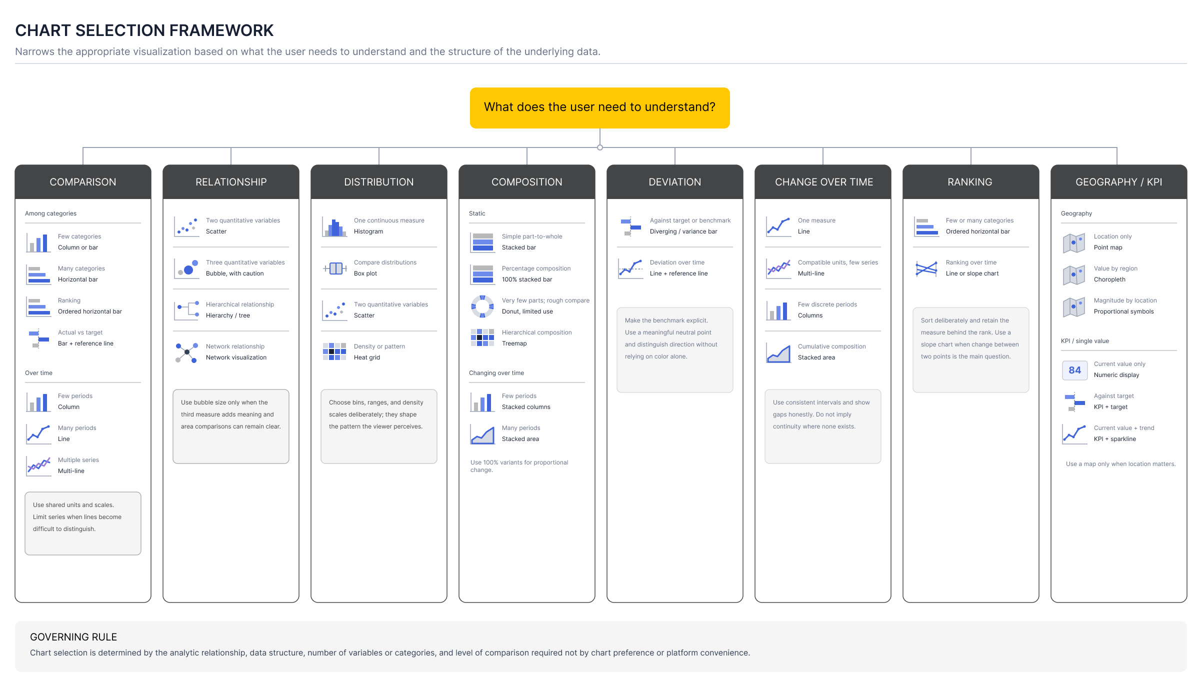
I developed a chart selection framework that considered the relationship alongside the structure and dimensionality of the data. Comparison, change over time, distribution, composition, correlation, ranking, and other relationships each introduced different possibilities. The number of measures and categories, whether the data was continuous or categorical, whether time was involved, and the level of precision required further narrowed the selection.
For example, a comparison across a small number of categories could be represented with a bar or column chart, while a large number of categories could be better represented with a horizontal bar chart. Change across many time periods could favor a line chart. Distribution of a continuous measure could require a histogram, while the relationship between two quantitative measures could require a scatter plot.
The goal was not to prescribe a chart from a single characteristic of the data. It was to systematically narrow the available representations until the chart matched both the analytic relationship and the data's structure.
Chart selection then became the first part of defining the complete visual representation:
Defined Requirements → Chart Selection → Visual Representation
The visual representation included the chart type and its visual encoding, scale, axes, labels, color, hierarchy, supporting context, and interaction.
Filtering, highlighting, drill-down, drill-through, and details on demand were determined by how users needed to explore or understand the data, rather than simply by the platform offering those capabilities.
The existing design system did not address data visualization conventions, so I extended it to establish them.
This included standards for chart selection and anatomy, axes and scales, labels and legends, interaction, visual hierarchy, and the use of color. I developed 10-color categorical palettes so visualizations with different numbers of data series could remain distinguishable and consistent across products.
The resulting Data Visualization Design System provided a common visual language for representing quantitative and categorical information rather than making those decisions independently for every visualization.
View the Data Visualization Design System ↗
The visualizations ultimately had to be implemented in Power BI, which introduced a significant constraint.
There was a difference between what Power BI was technically capable of producing and what the team could build. The implementation team primarily relied on Power BI's graphical interface and lacked the proficiency to use its more advanced capabilities.
I accounted for that constraint where possible, but implementation capability could not determine how the data was represented. A visualization could be simplified if the alternative preserved the same meaning. It could not simply be replaced with something easier to build if doing so changed what the data communicated.
That distinction became particularly important during implementation.
| Gate | Question | Action |
|---|---|---|
| 1. Meaning | Does the chart accurately represent the defined relationship? | If no, choose another representation. |
| 2. Native support | Can a standard Power BI visual reproduce the essential encoding? | If yes, specify native settings and continue. |
| 3. GUI feasibility | Can the implementation team reproduce and maintain it with current GUI proficiency? | If no, simplify without changing meaning, or escalate capability. |
| 4. Equivalent fallback | Is there a simpler visual that preserves the same analytic task? | Document the fallback and the tradeoff. |
| 5. Review | Does the implemented visual preserve scale, hierarchy, comparison, labels, and context? | Approve only if informational equivalence is maintained. |
My involvement continued after the visualizations were handed off for implementation. The team would recreate the designs in Power BI and return them to me for review and approval.
The problems I found went beyond visual fidelity.
In some cases, implementation decisions changed how the data itself was represented. Units of measurement could change between charts on the same page. Related visualizations could use their axes inconsistently. Numerical values were sometimes represented out of proportion because the accurate representation was considered visually undesirable. In other cases, a different chart was substituted because it was easier to produce in Power BI, even though it communicated a different relationship in the data.
These were not differences in styling. They changed what a user could reasonably conclude from the visualization.
I declined approval when that happened.
Repeated implementation reviews showed me that the requirements framework and design specifications were not enough.
The requirements established what the visualization needed to communicate, and my designs showed how I intended it to be represented, but the team also needed explicit rules for evaluating whether changes made during implementation preserved data integrity.
I began turning the recurring issues I found during review into a set of Data Visualization Principles.
View the Data Visualization Principles ↗
Implementation may change how a visualization is executed. It must not change what the data communicates.
The principles gave the team a shared standard for evaluating visualization decisions independent of a specific design. Rather than relying on me to identify each problem during review, the rules made explicit why practices such as changing units, distorting scale, or altering visual relationships were unacceptable.
The project exposed a larger problem than incomplete visualization requirements. The team's ability to produce accurate data visualizations depended too heavily on knowledge held by individuals rather than knowledge built into the process.
I therefore focused on leaving behind a structure the team could continue to use.
The Data Visualization Requirements framework established what needed to be defined before visualization design began and assigned ownership of those decisions across Product, Business Analysis, Data Science, Database Administration, and Design.
The Data Visualization Principles established the rules that representations needed to preserve, including accuracy, proportionality, consistent measurement, comparable scales, appropriate visual encoding, and sufficient context for interpretation.
The Data Visualization Design System translated those principles into repeatable standards for selecting, constructing, and interacting with visualizations across Clinisys products.
Together, they moved critical data visualization knowledge out of individual conversations and into a shared way of working. The goal was not simply to make my own visualization work more efficient. It was to give the team enough structure to define, evaluate, and manage visualization work without depending on a UX designer to reconstruct the underlying data logic each time.
That structure also returned the UX department to its actual specialty. Data visualization had become my responsibility not because it belonged with Design, but because of my earlier background in report writing that gave me data literacy the rest of the team didn't have. Once the requirements process, the design system, and the principles existed, the broader cross-functional team could take ownership of those decisions directly, and UX could return its focus to system functionality, the work it was actually built to do.
The Power BI implementation remained limited by the team's proficiency with the platform, but the framework provided something that had previously been missing: a defined standard against which an implementation could be evaluated.
One of the most important lessons from the project was recognizing when the problem extended beyond my role.
Requirements ownership was not a UX responsibility, and neither was establishing an organization's entire data visualization practice. But without those foundations, I could not design responsibly, and the team would remain dependent on whoever happened to understand the gaps.
My contribution therefore became less about designing individual charts and more about making the knowledge behind those decisions explicit.
That mattered because my own background was unusual. I started my IT career in report writing before moving into UX, which gave me data experience that another designer might not have. A sustainable process could not depend on the next person having the same background.
The project reinforced that sometimes the most valuable design work is not the interface itself. It is about identifying the knowledge a team relies on implicitly and turning it into a system that others can use.