Designing and validating a results-review workflow for lab professionals moving off two decades of legacy-system habits. The work was grounded in Jobs-to-Be-Done research and journey mapping with a Client Advisory Group of five client laboratories formed for the CLS Expansion Initiative, then validated through prototype design and moderated evaluation.
Clinical Pathology results review was being brought into CLS as part of a larger effort to expand the platform from environmental testing into healthcare. The challenge was not simply adding another workflow. The new experience had to replace a legacy system used by laboratory technicians for decades, while addressing a review process that required them to click through every auto-verified result and provided no way to configure review behavior by department.
I used the Client Advisory Group to understand how laboratories reviewed results in practice and built a journey map from the recurring themes across those discussions. I then created a Jobs-to-Be-Done canvas and led four workshops with the Product Owner, Business Analyst, and internal Subject Matter Expert to define what technicians needed to accomplish during review and where the existing process was working against them.
Those findings shaped the CLS Results Review prototype. I evaluated the design in two moderated sessions with three practicing laboratory professionals, producing 10 evidence-based findings and validating core decisions, including flag-based verification and inline historical results. Because participants had limited hands-on experience with CLS, the sessions evolved beyond the original usability-testing script into a more exploratory evaluation of the workflow and interaction model.
The prototype’s widget panel became the most consequential decision in the project. Widgets were widely viewed inside Clinisys as an outdated pattern, but I advocated for reviving and modernizing the concept, and client demonstrations of the panel drew a markedly strong response. The approach went on to shape direction beyond this project: Anatomic Pathology, a separate CLS initiative, restructured its own workflow to adopt the same widget-based pattern after seeing Clinical Pathology succeed.
Discovery came first, then definition, then validation. The journey map and the JTBD canvas (detailed in Research, below) established the design principles behind the CLS Results Review prototype, which two moderated sessions then evaluated. Both were scoped as usability testing but shifted into open, exploratory feedback once it was clear the participants had limited hands-on CLS experience.
CLS was originally built as an environmental LMS (Laboratory Management System): a task-based system where work runs in batches, suited to testing pond water or soil samples rather than reviewing an individual patient's results one specimen at a time, the model healthcare labs actually run on. Some disciplines, like microbiology, straddle both worlds. The same instrument can process a blood culture or an environmental sample, so a few clients had already been running healthcare work through CLS's environmental, task-based screens, and the fit was inefficient. Many of those healthcare clients had started out as environmental customers and expanded into healthcare as a growth opportunity, especially during COVID. The CLS Expansion Initiative set out to build proper healthcare support into CLS: a patient-centered results-review experience layered onto the same task-based core, without changing the batch architecture that environmental work (and shared disciplines like microbiology) still depend on. It was one piece of a broader push to consolidate the company's many separate laboratory products onto a single CLS platform.
The Clinical Pathology Results Review functionality evaluated here covers one stage of that initiative: the Resulting step, the post-analytical phase of testing, not the complete healthcare experience. It's newly built, not a redesign of an existing CLS screen, because no patient-centered review experience existed in CLS before it. For healthcare clients, it replaces one of several legacy products the company was consolidating onto CLS, a DOS-based, "roll and scroll" system some clients had used for over twenty years, predating the company's acquisition of the platform that became CLS. Analysts now navigate and filter results, verify flagged entries, and manage pending tasks from a backlog page instead. This study asked whether that new workflow held up for lab professionals who'd spent years, in some cases decades, inside that legacy system's habits.
Task completion wasn't the only goal. The bigger question was whether CLS matched the terminology, review pace, and organizational habits analysts rely on daily, for people transitioning off a legacy system rather than starting fresh.
The Client Advisory Group met regularly throughout the project, with representatives spanning technologists, supervisors, lab managers, administrators, and pathologists, giving the team a continuing check against real laboratory practice. The product team facilitated those sessions; I attended, documented observations, and synthesized the recurring themes into the journey map myself, using custom Copilot prompts and agents built around the group's meeting structure to process session transcripts and recaps, reviewing and updating it in weekly working sessions with the Product Owner, Business Analyst, and an internal Subject Matter Expert as the current-state Resulting workflow took shape.
What started as a request to improve visibility into failed auto-verification results expanded into a broader workflow problem, one grounded in the advisory group's own evidence rather than internal assumptions about how labs operate.
These themes shaped the journey map that documented the current-state Resulting workflow across four steps, from opening the backlog through manual differential and supervisor review.
Goal: quickly identify the next result requiring attention and understand why it needs manual review. Technicians filter by instrument, department, and date range every time, filters that don't persist, and can't see why a result failed auto-verification until they open it. Opportunity: save backlog state, restore filters automatically, and surface the failure reason up front.
Goal: evaluate all available information and confidently determine the appropriate result for release. Everything needed (runs, historical results, QC, scattergrams, alerts, flags) exists, but it's spread across separate locations, and comparing multiple runs adds complexity. Opportunity: a unified Result Workspace with side-by-side run comparison.
Goal: complete a manual differential when automated analysis can't determine an acceptable result. Technicians need to document findings without losing their place in the Resulting workflow. Opportunity: integrate manual differential directly into the Resulting experience rather than treating it as a separate detour.
Goal: review results requiring additional oversight before release. Supervisors need clear ownership of assigned work, supporting information without extra digging, and a clean handoff back to the technician. Opportunity: a dedicated review queue with consolidated context and streamlined approve/return actions.
The job: review a specimen test panel and release the complete result.
I planned and facilitated four Jobs-to-Be-Done workshops with the Product Owner, Business Analyst, and an internal Subject Matter Expert to define who performs the job, what starts and completes it, and the rules each client configures differently, much of it directed by what the Client Advisory Group had been telling us. Then I documented, synthesized, and independently built the final JTBD artifact.
Three requirements carried straight into the first prototype: table configurations had to persist across sessions, active and historical results needed to be presented together, and review and release had to adapt to each client's configured rules rather than assume one workflow fit every laboratory.
Discovery ran on two tracks. The Client Advisory Group fed the journey map I built, showing how the current workflow actually behaves. Separately, four JTBD workshops with the Product Owner, Business Analyst, and an internal Subject Matter Expert defined what technicians needed from the job itself. Together, these two tracks surfaced three recurring problems: repetitive navigation, decision-making information scattered across multiple sources, and exception workflows that interrupted the primary process instead of integrating with it. Those problems became the design principles below, which shaped the CLS Results Review prototype that two rounds of usability testing then evaluated.
Eight principles, distilled from the Jobs-to-Be-Done and journey-mapping research (including evidence from the Client Advisory Group), guided the CLS Results Review prototype design.
Technicians shouldn't lose their place, their filters, or their train of thought moving between the backlog, a record, and back again.
Resulting happens continuously through the day; the same filtering and setup shouldn't have to happen every single time.
Why a result failed auto-verification should be visible from the backlog, not discovered only after opening the record.
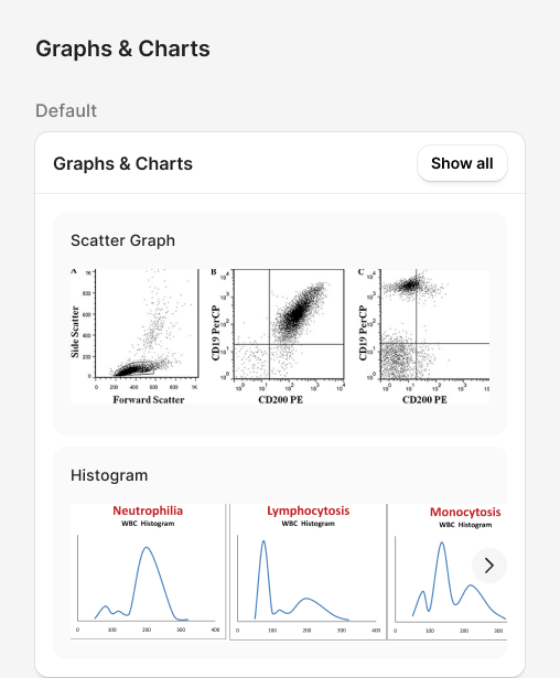
Instrument runs, historical results, QC, scattergrams, and flags should live in one place instead of forcing technicians to hunt across screens.
Manual differential and supervisor review are real parts of the process and need clear ownership and handoffs, not detours that break continuity.
What needs attention first should be obvious at a glance, not something technicians have to work out themselves.
Auto-Post, dashboard widgets, and review processes vary by client; the workflow needs to flex rather than assume one setup fits every lab.
Supporting information should appear where the decision is being made, not require a separate lookup.
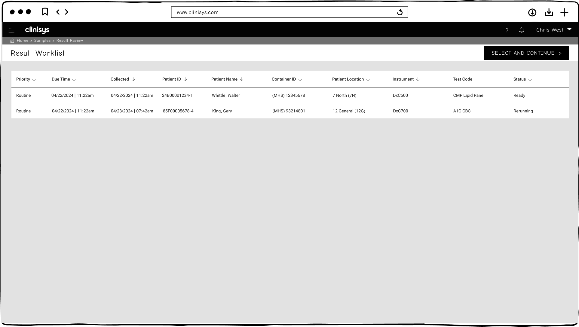
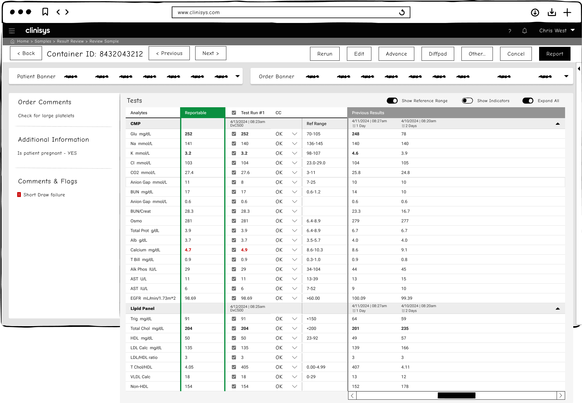
Two moderated sessions evaluated an earlier round of the prototype, shown below, before the design evolved into the final version shown next in this section. This early round grouped supporting information into a fixed sidebar of always-visible panels (Order Comments, Additional Information, Comments & Flags) rather than the modular widgets that came later. Both sessions were originally scoped as usability testing but shifted into open, exploratory feedback once it was clear none of the participants had much hands-on CLS experience.
Left to right: Early Result Worklist · Early Review Sample with fixed info sidebar. Click to enlarge.
One-on-one, ~75 minutes. A supervisory role spanning hematology and blood banking, with extensive laboratory operations, microbiology, and management experience, plus substantial familiarity with the legacy system. That combination brought deep legacy fluency with enough distance to compare critically.
Small-group of two, ~65+ minutes. Two current laboratory staff members from an organization that had run the legacy system for roughly 20 years; P3 was comparatively new to both the lab and the system (~2.5 years), contributing a perspective less shaped by long-standing habits, while P2 was a longer-standing member of the same team. The session recording only captured one speaker label for the pair, so comments below are attributed by content and context rather than a verified transcript split.
"Most of us are generalists working across departments, simple filters might be more practical than each member of the team building their own queries."P1, Session 1
"Right now, the legacy system requires clicking through every auto-verified result. I'd love a system that skips those unnecessary steps."P1, Session 1
"If an analyzer initiates a rerun, could the system mark it as 'in progress' to prevent premature review?"P2, Session 2
"Could results be displayed as graphs for easier visualization of trends, especially for conditions like oncology or therapeutic monitoring?"P3, Session 2
Although participants identified several opportunities for improvement, the sessions also validated important aspects of the CLS design.
Once explained, participants responded positively that CLS surfaces only flagged results needing verification, removing the redundant clicking the legacy system requires for auto-verified results.
Having historical results available within the same review workflow was seen as a clear improvement over switching between systems.
The ability to run ad hoc queries without saving, while still supporting saved "tile" views for frequent use, matched how generalist staff actually work.
CLS's export and print capability was confirmed to meet the needs of paper-heavy departments still transitioning off the legacy system.
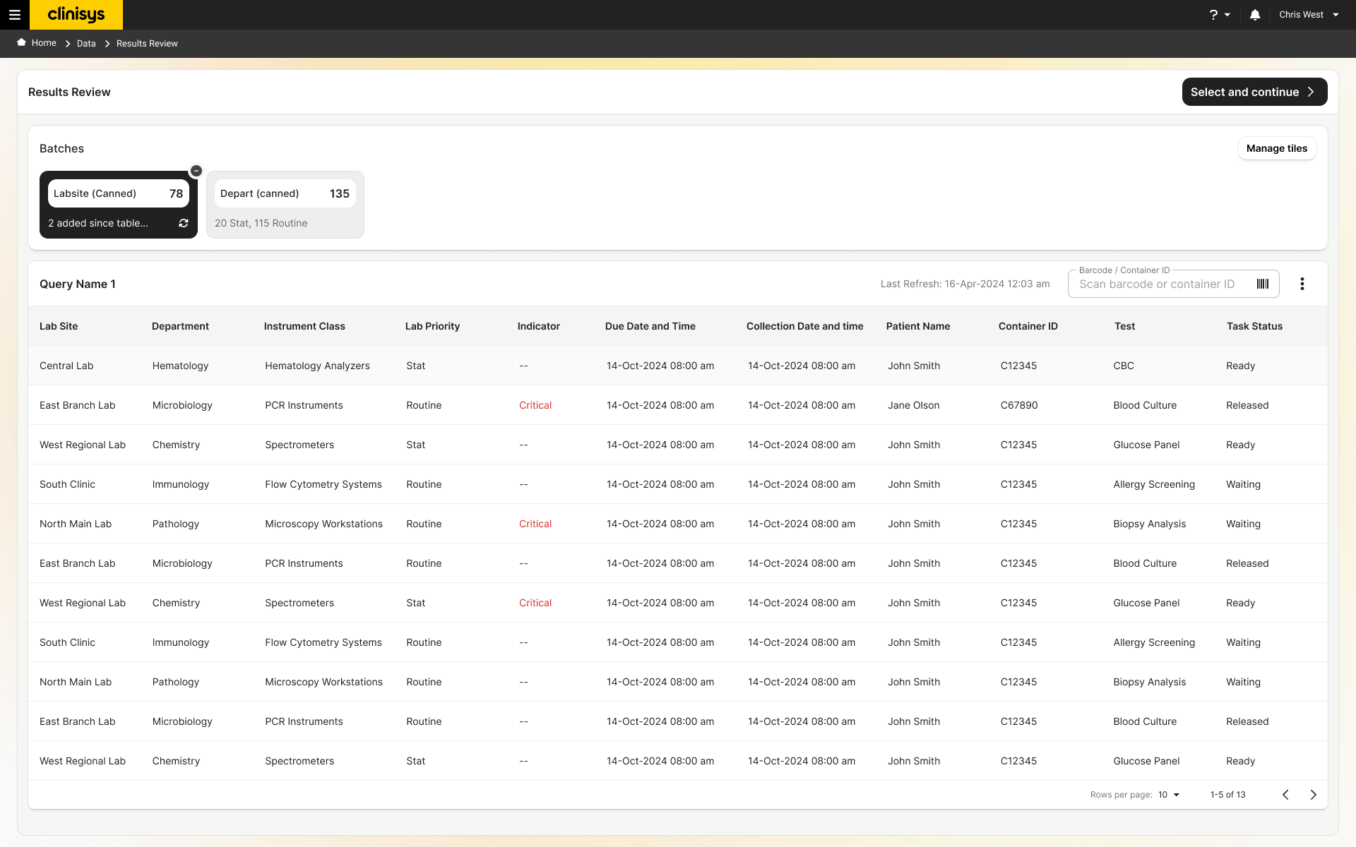
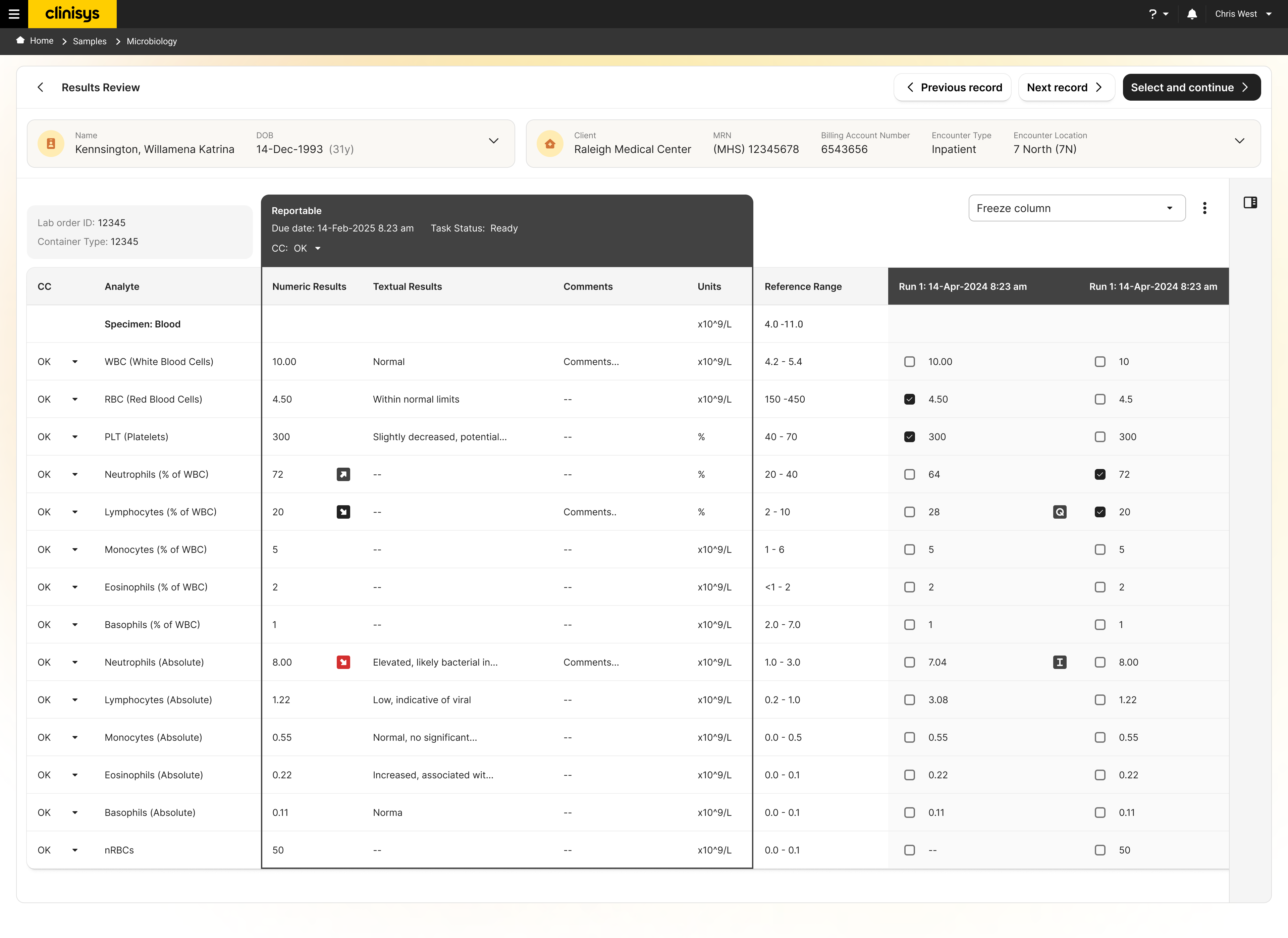
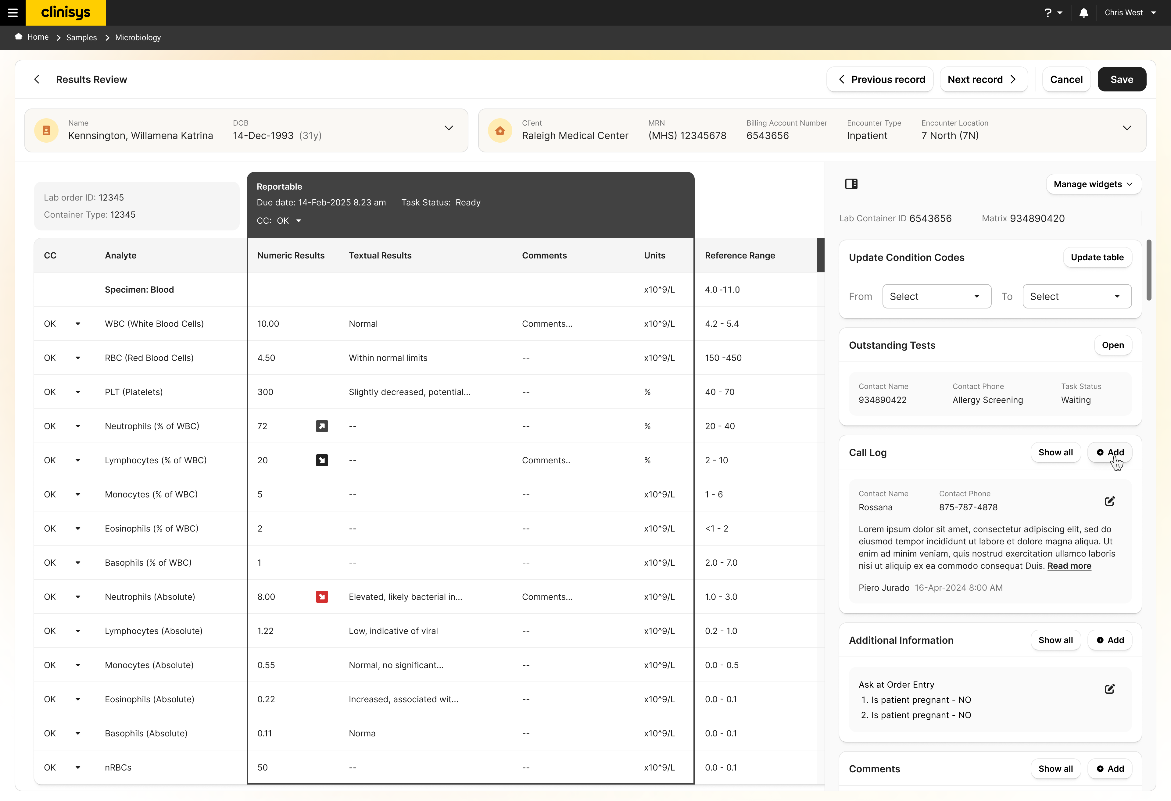
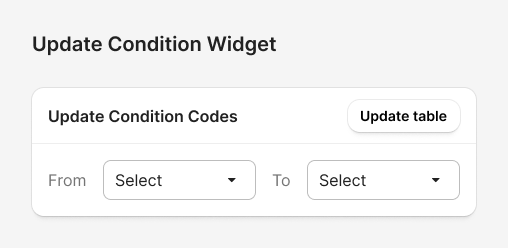
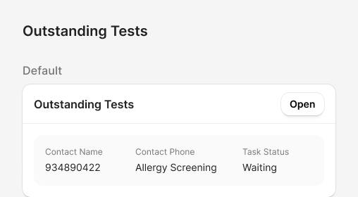
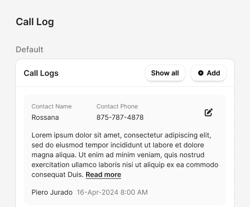
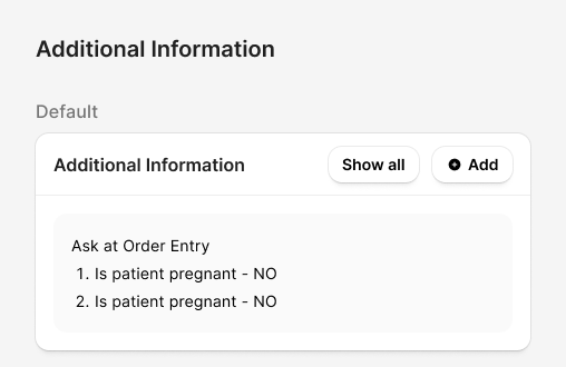
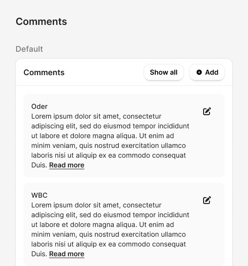
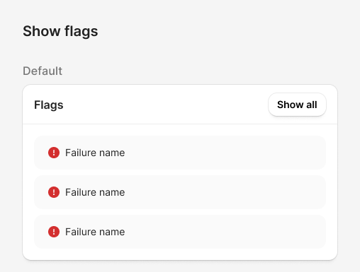
The final prototype: the backlog analysts triage first, the results table for a single record, and the same table with the right-side widget panel (condition codes, outstanding tests, call log, additional information, comments) open.
The backlog stays true to CLS's batch/task structure, grouped by instrument, department, and priority, while opening a single result shifts into a patient-centered workspace built around one specimen at a time. That split let Results Review sit on top of the existing task-based core without requiring CLS to change it.
The widget panel wasn't a new idea. Clinisys had built an earlier web-based application that let pathologists work remotely by connecting them to their in-house legacy system, and pathologists responded well to its specialized widgets, which let them review information and complete tasks without leaving the report they were writing. That application stayed confined to remote review for pathologists and never extended into other roles or disciplines, but the widget pattern itself proved out. That precedent carried directly into how Clinical Pathology Results Review's own widget library was designed.
Reviving that pattern wasn't an easy sell. The prevailing view inside Clinisys was that widgets were dated, a relic of early-2000s interface design, not a serious pattern for a modern product. I advocated for it anyway, and rather than reusing the earlier concept as it was, I modernized it and packaged it into the library Results Review shipped with.
Left to right: Backlog / batch triage · Multi-run result comparison · Result review with widget panel. Click to enlarge.


The project delivered 10 evidence-based findings, eight design principles, and a set of validated design decisions: the concrete outputs this research produced for the product team to act on. Results Review has shipped, but full adoption is still rolling out. Clients moving off the legacy system need CLS implemented and their data migrated first, typically a 9 to 12 month process given how large and complex these systems are; clients already on CLS received the new functionality in smaller phased releases instead, to test and iron out issues before wider implementation.
Client reception reinforced that direction. Demonstrations of the widget panel and the results-review workflow drew a markedly strong response from clients, and the approach proved influential beyond this one project: Anatomic Pathology, a separate CLS initiative, restructured its own workflow to incorporate the same widget-based approach after seeing Clinical Pathology succeed.
Two moderated sessions and monthly Client Advisory Group meetings throughout the project pointed the same direction: CLS's backlog-based review model and flag-driven verification are directionally right for users moving off the legacy system's manual, click-heavy workflow. But adoption depends on giving departments control over refresh behavior, worklist organization, and query management, rather than enforcing one fixed configuration.
The most urgent gaps to address as rollout continues are compliance-adjacent: call-log linkage and specimen-condition visibility. And because both sessions drifted from usability testing into open-ended feedback, these findings are directional rather than conclusive. A follow-up round with hands-on CLS prototypes would help validate the resulting design changes.
Results Review is scoped to one stage of the testing process, the post-analytical phase, not the complete healthcare experience CLS is expanding to support, but it's also part of a broader consolidation still underway across the company's other products. How well it lands for users transitioning off decades of legacy habits will likely shape the approach for the workflows and products still making that same move.
That influence isn't hypothetical; it's already happened once. The widget-based approach built for this project met real internal resistance as a dated pattern, but it proved itself through client reception strong enough that Anatomic Pathology restructured its own workflow to match it. That's the clearest evidence of how far this project's impact reached beyond its own scope.