Rossana Babakhani ← Back to work
Case Study

Keyboard Accessibility & Interaction Strategy

CLS was built on Kendo UI's Data Grid, a dense, spreadsheet-style component, while the rest of Clinisys's application suite used a simpler Table pattern. I found that inconsistency while documenting keyboard shortcuts, and spent the next several months building the evidence and the strategy to prove where each pattern belonged — through a migration, an organizational decision that didn't go my way, and a client complaint that showed the concern was never just a preference.

RoleUX Researcher / Designer
PlatformClinisys Laboratory Solution (CLS)
TimelineSeveral months, across multiple phases
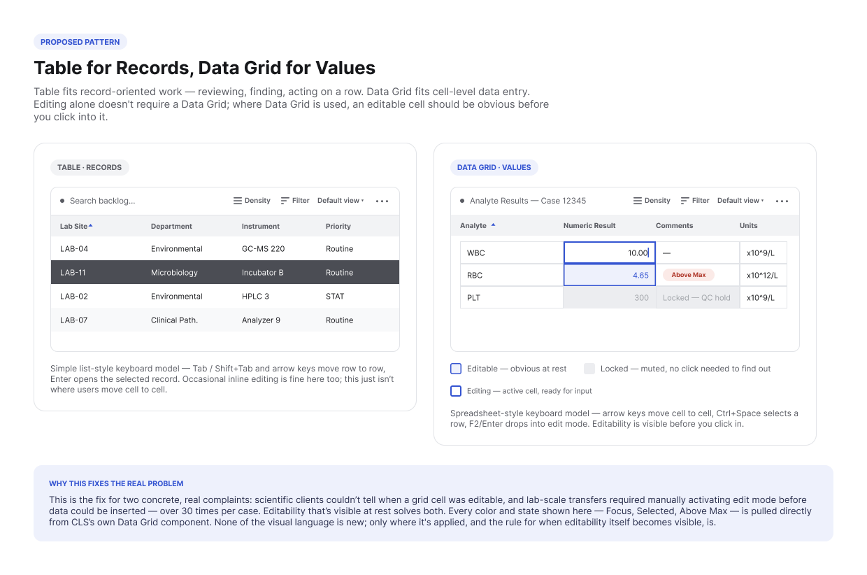
Collage of the proposed Table pattern for record-oriented review and the proposed Data Grid pattern for cell-level values

Clinisys builds CLS for laboratories spanning scientific testing and healthcare alike (see Designing a Shared Laboratory Experience for the full domain picture). CLS was originally built for scientific, batch-oriented workflows on Kendo UI, and its Data Grid became the default way to view and edit large datasets: dense, spreadsheet-like, built for handling many rows of results at once. Every other application in the suite, serving simpler navigation and list needs, used a plain Table instead.

That distinction had gone unnoticed for years, because most teams never needed to touch both patterns at once. It became unavoidable for two reasons at the same time: Clinisys was migrating its whole design system from Kendo UI to Google Material, and CLS itself was being expanded to support healthcare laboratories, not just scientific ones, for the first time.

Found While Documenting Keyboard Shortcuts

While writing keyboard-interaction documentation for CLS's components, I found that Data Grid already behaved like a spreadsheet in production — arrow keys moved cell to cell, Ctrl+Space selected a row, Enter moved focus downward. When I went to document the equivalent behavior for Table, there wasn't one to document. The existing spec's accessibility section for Table said only “keyboard navigation considerations,” a placeholder standing in for a real answer.

ShortcutData Grid (in production)Table (undocumented)
Arrow keysArrow keys move one cell at a timeUp/Down move focus to the previous/next row — standard baseline behavior, but never formally specified in Table's own spec
Row selectionCtrl+Space toggles selection of the focused row — CLS's own remap; the spreadsheet-standard binding is Shift+SpaceUndefined
Grid edgesCtrl+Home / Ctrl+End jump to first/last cellUndefined
Header controlsAlt+B moves to grid header buttons, preserving row selectionUndefined
Basic focusTab / Shift+Tab move cell to cellPresumed to move control to control, never specified
Edit modeF2 triggers edit mode on the focused cell — only meaningful because Grid distinguishes focus from editingNo equivalent state to define

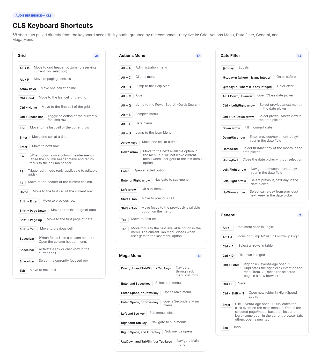
Sample rows from the keyboard accessibility audit I ran across CLS's grid, menus, and date filters.

Almost none of this was CLS inventing its own keyboard language. Data Grid's core behavior — arrow keys moving cell to cell, Tab/Shift+Tab moving control to control, F2 entering edit mode, Ctrl+Home/Ctrl+End jumping to the first or last cell — matches standard spreadsheet convention exactly, the same muscle memory anyone coming from Excel or Google Sheets already has. CLS layered in only a couple of its own: Alt+B to jump to the grid's header buttons without losing row selection, and remapping row selection to Ctrl+Space (spreadsheet convention reserves that one for the column and gives the row to Shift+Space). The date filter has one more addition in the same spirit — an empty date field fills in today's date on Down arrow, and Up/Down steps whichever date segment has focus. I'd remembered that one as an Excel shortcut; it isn't — Excel has no native keyboard shortcut for stepping a date. It's a convention from Kendo UI, the framework CLS was originally built on, which defines exactly this behavior for its own date-input controls.

Why it mattered

Two patterns that looked alike side by side were, under the hood, entirely different keyboard experiences. Migrating to Material without resolving this meant either carrying the inconsistency forward permanently or rebuilding it by accident in a new framework. It had gone unreviewed by the Architecture group and everyone else — I only found it because documenting keyboard behavior forces you to specify what everyone else glosses over.

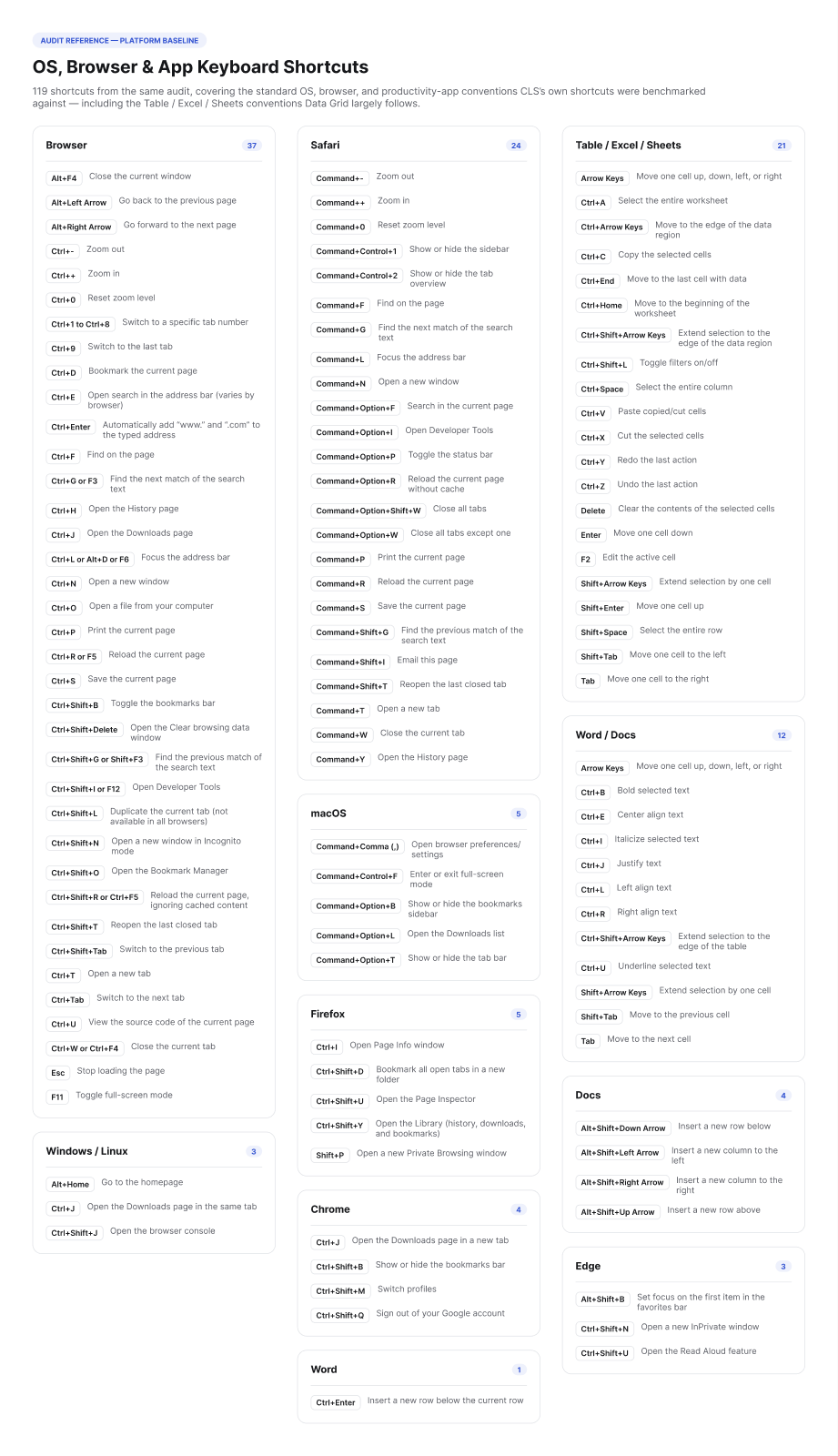
A gap like this is easy to wave off if it's argued abstractly. Before proposing anything, I audited CLS's actual keyboard behavior end to end — every shortcut in use across the grid, the actions menu, the mega menu, and date filters — and cross-referenced it against standard OS and browser keyboard conventions (Windows, macOS, Safari, Chrome, and common productivity tools). That gave me a complete inventory of what CLS actually did and a baseline for what users would already expect. The overlap, and the gaps, became the argument.

Shortcuts audited69 CLS-specific + full OS/browser baseline
By areaGrid 21 · Actions Menu 17 · Date Filter 14 · General 9 · Mega Menu 8
MethodFull keyboard inventory vs. platform conventions
Used forEvery stakeholder conversation that followed

Around the same time, Clinisys began scoping CLS's expansion into healthcare laboratories. Healthcare's needs looked simple by comparison to Scientific's: a table with a small number of cells supporting inline edits was enough. I raised the concern that standardizing on that simplified table wouldn't hold up once Scientific's batch, spreadsheet-style workflows moved onto the same new design system — the two businesses needed genuinely different interaction models, not one pattern stretched to cover both.

That concern didn't make it into the final direction at the time. Design leadership had recent working history together and aligned around the simpler approach, and engineering, working from that direction, built primarily toward Table. It's a familiar shape for how organizational decisions get made under time pressure: the loudest, simplest signal available in the moment carried more weight than a nuance that hadn't yet been proven with evidence.

What I'd already flagged

  • Scientific's batch data-entry workflows depend on Data Grid's spreadsheet-style interaction, not Table's simpler list behavior.
  • A table built for healthcare's limited, patient-case-oriented data wouldn't scale to Scientific's dense, editable datasets.
  • The keyboard-navigation audit already showed the two patterns diverging in ways users would notice immediately.

Where the gap showed up

  • Development began migrating CLS Scientific onto the new design system using the table-first direction.
  • It became apparent quickly that Table alone couldn't support Scientific's batch, spreadsheet-style data entry.
  • The Scientific business group escalated internally once the gap was concrete rather than hypothetical.

What validated the original concern wasn't one event, it was two independent ones arriving close together. Internally, the Scientific business group escalated once the migration made the table-only approach's limits concrete. Separately, a client reported a keyboard accessibility issue tied to exactly the Grid-versus-Table inconsistency I'd documented months earlier. Neither escalation referenced the other, which is what made them convincing together: the same root cause was surfacing from two directions that had no reason to coordinate.

Vindication, with a caveat

Being right and being adopted don't run on the same timeline. Both signals confirmed the diagnosis. Neither one, on its own, changes the cost of reworking code that was already built the other way.

Keyboard Accessibility Strategy

The Grid-versus-Table problem was the most visible symptom, but the underlying issue was bigger: the design system had no shared point of view on keyboard interaction at all. I wrote a Keyboard Accessibility Strategy defining principles meant to guide every component going forward, not just patch the one I'd found.

Focus Management

Visible focus indicators, logical order, predictable focus return after actions like closing a modal.

Navigation Patterns

Skip links, consistent layouts, global shortcuts for common actions like search or menus.

Keyboard Shortcuts

Context-sensitive, discoverable shortcuts with on-screen hints and room for customization.

Complex Interactions

Full keyboard operability for grids, sliders, carousels, multi-select, and context menus.

User Education

A discoverable shortcut guide, onboarding, and contextual help.

Dictation Compatibility

Shortcuts that coexist with dictation software rather than conflicting with it.

Full strategy also covered keystroke efficiency in repeated data-entry workflows, keeping focus, selection, and edit state visually distinct wherever a component supports more than one, and a testing checklist for validating keyboard behavior end to end, not just at final accessibility review.

View the full strategy plan ↗

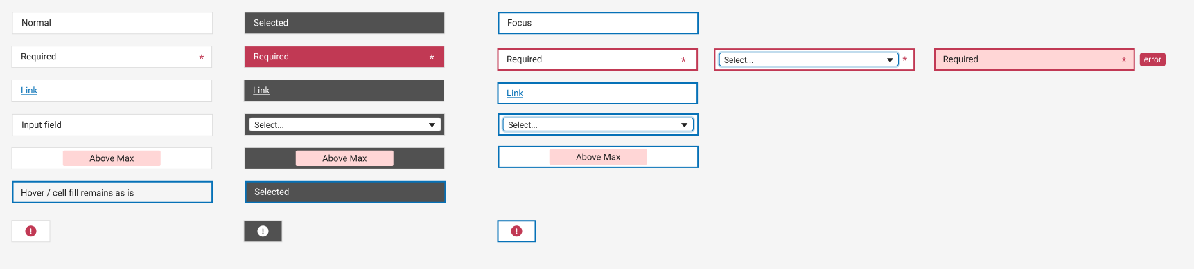
Before sketching anything new, I went back to what CLS's Data Grid already defined. It turned out the component already had a real visual vocabulary for state: cell-level treatments for Normal, Required, Link, Input field, and a value-threshold flag (Above Max), plus a distinct Hover behavior — all shown across Normal, Selected-row, and Focus contexts, so the difference between "this row is selected" and "this cell has keyboard focus" was already unambiguous. I'm including one real screenshot of it here mainly to show how much was already there: this wasn't a blank slate. CLS Scientific used the hell out of this functionality already, and still needed more — none of it had been extended to answer the editable-versus-locked question that was actually causing friction. The vocabulary existed; it just hadn't caught up to how hard the product was already being used.

Real CLS Data Grid cell states: Normal, Required, Link, Input field, Above Max, and Hover, shown in Normal, Selected-row, and Focus contexts

A real component state sheet pulled from CLS's Data Grid, not recreated for this write-up.

My recommendation: support both Table and Data Grid as first-class patterns in the design system, with clear guidance for when each applies — not because they look different, but because the keyboard audit proved their interaction is fundamentally different underneath.

The two already have a lot in common — both can sort, filter, select, act on records, edit, configure columns, and paginate. The real difference is how a user works with the data. Table fits workflows built around records: reviewing information, searching or filtering a list, selecting a record, taking an action on it — the shape of most healthcare workflows, where the focus is a patient, specimen, order, or result, not every individual cell. Data Grid fits workflows built around values: moving between cells, entering or editing a series of numbers, selecting cells or ranges, copying and pasting — the shape of Scientific's batch data-entry workflows. Editing alone doesn't require a Data Grid; Table supports editable content too. Data Grid earns its extra complexity only when cell-level interaction is actually part of the job.

View the full proposal document ↗

Use Table when

  • The primary task is reviewing or finding records.
  • Actions apply mainly to a row or record.
  • Users need sorting, filtering, search, or row selection.
  • Editing is occasional and doesn't require moving through cells.
  • Cell-level keyboard navigation wouldn't improve the workflow.

Use Data Grid when

  • Users need to enter or edit multiple values.
  • Users need to move between cells with the keyboard.
  • Repeated or batch data entry is part of the workflow.
  • Cell or range selection is required.
  • Copy and paste between cells is useful.
  • Users need to work quickly through a large set of values.

Where Data Grid is the right call, a handful of interaction details have to be deliberate rather than incidental:

Editable Cells

Editable and non-editable cells need a clear visual difference — visible before a user tries to edit, not after. Threshold flags like Above Max keep working exactly as they already do.

Focus vs. Edit Mode

A cell with keyboard focus and a cell being edited are different states and should look different — built on CLS's existing Focus treatment, not a new one. Especially important for scientific workflows entering many values in sequence.

Selection

Cell, range, row, and column selection need clear visual states, visible before an action like delete, copy, paste, or bulk edit.

Keyboard Shortcuts

Discoverable in the product itself, not something a user has to already know — shortcuts came up in nearly every client conversation.

Locked Cells

A tooltip explaining why — calculated, interfaced, or permission-restricted — turns a dead end into an answer.

Why Focus vs. Edit Mode isn't academic

A client whose lab pushes results straight from a connected balance into CLS put the current friction plainly: “You actually have to put this box into edit mode first… you basically just have to hit zero, or F2 or whatever, and then you hit the button on the balance. Not a big deal, but it's one of those little things that just makes a huge difference in your day.” — a Scientific client running interfaced instruments. Multiply that one extra keystroke by every interfaced result, every day, and it stops being a small thing. That's exactly the friction a visible, distinct edit-mode state is meant to remove.

Table and Data Grid still need to feel like one product. They share toolbars, headers, search, filtering, column settings, actions, and pagination, and where functionality is shared it should behave identically. The differences should live only where the interaction actually changes: navigation, focus, selection, and editing.

Three of those shared behaviors are worth calling out specifically — not as guesses, but because Results Review testing and real client conversations flagged the same gaps independently, on both patterns:

Filtering

Visible and consistent in both patterns, not spread across menus. The most immediate complaint in Results Review testing: “Filtering is scattered. I keep jumping between menus just to narrow what I'm looking at.”

Saved Views

Column widths, sorts, and filters should persist across navigation. Testing and a client conversation surfaced the identical complaint independently — once for Table, once for Grid — settings resetting the moment you leave the page.

Density

Users need control over row density. Testing found the default too spacious, and clients running tests with a dozen-plus analytes wanted meaningfully more rows visible without scrolling.

Five more gaps came from that same evidence — they just don't show up as toolbar controls:

Reduce Record-to-Record Hopping

Users need to see related information without clicking through each record one at a time. Testing surfaced this directly: wanting to see values across everything, not analyte by analyte.

Full Functionality in Comparison Views

A comparison layout like Pivot shouldn't be a stripped-down mode. Filtering and commenting need to keep working there exactly as they do everywhere else.

Error Visibility at a Glance

Problems shouldn't require clicking into every cell to find. A visible flag for out-of-range or invalid values needs to be scannable across the whole view, not discovered one click at a time.

Position Persistence

Drilling into a flagged record and returning shouldn't lose your place. Scroll position and selection need to survive that round trip, in both Table and Data Grid.

Reportable vs. Internal-Only

Values headed for the final report and values that are internal-only need a visual distinction, not just role-based access controls behind the scenes.

Proposed pattern: Table for record-oriented review with simple list-style rows and CLS's real Selected-row treatment, versus Data Grid for cell-level values with true cell borders, distinct editable/editing/locked cell states built from CLS's real Focus and Selected tokens, and a real Above Max threshold pill. Both share the same Density, Filter, Default view, and overflow-menu controls in the toolbar, and both show a sort indicator on the first column header.
Migration, not replacement

Existing Clinisys grids shouldn't be automatically swapped for the new Data Grid component. Each workflow gets reviewed on its own terms during the MUI migration: record-oriented work moves to Table, value-oriented work stays on Data Grid. It's the same judgment call I was making about Scientific and healthcare from the start — just applied consistently, workflow by workflow, instead of decided once for the whole product.

Outside of the two signals that actually validated the keyboard decision, Table and Grid feedback kept surfacing from two other directions. Clinisys ran usability testing on CLS's Results Review screen — a separate project evaluating Table's own experience rather than the Grid-versus-Table question above — and a handful of its findings landed on this same territory. Separately, outside of any formal study, table and Grid feedback came up constantly in client conversations over the years: requests for grid functionality, and, almost without exception, a question about whether keyboard shortcuts were going away. I don't have a transcript for every instance of that second one, but it came up often enough that it shaped how I thought about the strategy from the start: whatever changed, the shortcuts couldn't be collateral damage. None of what follows is offered as proof of the keyboard decision itself — that's what the two independent signals were for — but it's real, recurring evidence that Table and Grid both had usability gaps of their own.

01

Table Layout Required Excessive Navigation

Participants wanted to reduce back-and-forth between samples and analytes.“I wish I could see all analytes across everything without clicking through each one.” — Participant A

02

Filters Were Hard to Find

Filtering was scattered across the interface, requiring multiple clicks.“Filtering is scattered. I keep jumping between menus just to narrow what I'm looking at.” — Participant A

03

Table Settings Reset After Navigation or Commenting

Filters, sorts, and layouts reset after leaving the page or adding a comment.“I always resize columns, but every time I come back, they're back to default.” — Participant B

04

Table Density Was Too Spacious

Participants wanted a more compact table to reduce scrolling.“There's too much spacing — I want more rows on screen.” — Participant B

05

Pivot View Enabled Comparison but Limited Interaction

Helpful for side-by-side comparison, but restrictive for filtering and commenting.“The pivot makes it easy to compare values side-by-side, but I can't do much else in it.” — Participant A

06

Grid Customizations Didn't Persist

The same complaint Results Review testing surfaced for Table above showed up independently for Grid, in a real client conversation.“Grid customizations don't persist the way I need them to. Losing grid settings after configuring them is frustrating.” — Participant C

07

Errors Got Lost in Dense Grids

Problems in a cell weren't visible from a normal scan — they had to be found by clicking in.“Failures aren't always obvious in the grid. You often have to click into each analyte to see what's wrong.” — Participant D

08

Drilling In and Back Out Lost Your Place

Reviewing a flagged sample and returning to the grid meant losing your position in it.“When you drill into a sample and go back, you lose your place in the grid. You have to scroll back and find where you were.” — Participant D

09

Reportable and Internal-Only Values Looked the Same

Nothing in the grid distinguished a value headed for the final report from one that wasn't.“Some analytes are reportable and others are internal-only, but they look the same. It would help to visually distinguish what actually matters for release.” — Participant D

10

Wanted More Rows Visible at Once

Tests with many analytes made a fixed, short table feel cramped.“I want to see a lot more than four. Some of our tests have like 18.” — Participant D

11

Wanted More Keyboard, Less Mouse

Switching between mouse and keyboard mid-task was slowing the whole review down — direct support for the Complex Interactions and Navigation Patterns pillars of the strategy.“I dislike having to go from the mouse to the keyboard all the time. That slows everybody down … if you could make some of these more keyboard [accessible] … But then if I want to do anything, I have to use the mouse to move to the right place.” — Participant D

By the time I left Clinisys, the keyboard strategy hadn't been formally adopted system-wide. Fixing the Grid/Table inconsistency properly meant reworking a meaningful amount of already-built code, and leadership was hesitant to commit to that all at once — so smaller, one-off fixes kept shipping instead of the systemic solution. The work itself happened in stretches rather than all at once: the audit and the strategy were each picked up, set down, and revisited months apart as other priorities took precedence, which meant re-making the case more than once.

What it did accomplish

The audit and strategy left a clear, evidence-backed reference for the Grid-versus-Table inconsistency, grounded in real keyboard behavior rather than opinion. Two independent signals — an internal escalation from the Scientific business group, and a client-reported accessibility issue — confirmed the diagnosis was right, even before the organization was ready to act on it at scale.

Discovered

Found the gap documenting keyboard shortcuts

Audited

Catalogued CLS shortcuts vs. platform conventions

Flagged

Raised the risk before the healthcare direction shipped

Surfaced

Migration exposed the gap; Scientific escalated

Validated

A client-reported issue confirmed the concern

Identifying and correctly diagnosing a systemic accessibility problem is its own skill, separate from an organization's willingness to absorb the cost of fixing it. This case study is the honest version: the diagnosis was right from the first audit, the evidence held up under two independent validations, and the full system-wide fix still hadn't shipped when I moved on. I'd rather document that distinction clearly than imply an outcome that didn't happen.